Japanese Candlestick History:
The candlestick charts were first developed in the 1700’s by a rice trader named Munihisa Homma from the town of Sakata. He developed a technical analysis methodology to help him analyze the price of the rice future contracts. It was then introduced to the West in the 1990’s by Steve Nison. Since then, many modifications were made before the system we know as candlestick charting today became a popular trader’s tool.
Japanese Candlestick Explained:
Each candlestick displays a high, low, open and close for the period of time the price chart is covering. The wick and the shadow (lower wick) of the candle show the price range of the period used and the range between the opening price and the closing price is represented by a wide body.
A typical chart with candlesticks comprises of consecutive bars which are known as candlesticks and these can be represented in different colors. Each of these bars also represents a time span such as a minute, an hour, a day or a week and so on. The time slots that the candlestick chart is based on has no bearing on its color as any candle that is green or unfilled simply denotes that the closing price was higher than the opening price. The variations in height and color of the candle are based on other facts and changes.
How To Read Japanese Candlestick Chart?
- If the price closes above the opening price the body is Green or not filled (on Metatrader default template).
- If the price closes below the opening the body is Red or filled (on Metatrader default template).
Click on the image to open the full size version!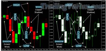
- A hollow candle or a green one (1) means that the buyers determined the price of the underlying asset or the security as a rise in the price has taken place over the period considered. However, to predict the path of the currency trading prices a trader will require more information than this.
- Filled candlestick bars (2) are usually depicted in charts in red color and here the underlying asset’s opening price is higher than the price it closed at. Meanwhile a trader has to understand that an unfilled bar always shows times when the price rose. In the same vein, a trader has to understand that a red or filled bar denotes times where the price declined.
The candlestick bar charts and the colors used in them are simply used to highlight the information visually. The very same information can also be conveyed by simple OHLC (open, high, low and close) bar charts. The reasons why colored candlestick charts are popular are because they are easy to interpret with even beginners understanding them. The information that is conveyed can be done instantly with this method. These charts are also useful in tracking trend changes in the marketplace. The different candlestick patterns also have interesting names (such as spinning tops or shooting stars) allowing traders to remember them with ease.
Japanese Candlestick Patterns:
Candlestick chart patterns enable the trader to identify and interpret in which direction the market is likely to go. There are literally over forty different candlestick chart patterns but to be able to successfully interpret and predict the future price movement a trader only really needs to learn the major candlestick patterns. The term major is used in the sense that these patterns tend to occur more regularly than the other patterns but are still very valuable to the trader in presenting him with trades that are profitable as well as being strong enough to clearly show where the market is heading. The use of the major patterns will provide traders with enough Forex trading time to enable them to make profits.
The Doji Candlestick Patterns:
A Doji is a pattern that occurs in a session of trading where the opening and closing price of an asset are almost equal. It signals market indecision and the potential for a change in trend direction. This led to no dominant directional force on the price which may have moved between the open and close levels of the candle, but the market was indecisive about where to take the currency pair (up or down).
There are five types of Doji candlesticks and for the most part, they tend to look like a cross or a plus sign and have virtually nonexistent bodies with relatively larger shadows. They are one of the easier candles to identify and their wicks and shadows provide excellent guidelines regarding where a trader can place their stop.
For example, when the Doji patterns appear, they are either on the top of a retracement in the downtrend or below a retracement in an uptrend. At such times, traders can consider trading the Doji in the direction of the trend and the stop-loss can be placed below the lower wick in an uptrend or above the upper wick in a downtrend.
The Standard or Neutral Doji Candlestick Pattern:
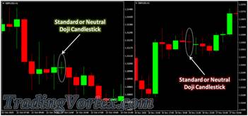
Known as Doji Star, it shows that the opening price and the closing price are very close together or are the same. The length of the wick or shadow has no relevance to this pattern. It shows indecision in the marketplace and that neither the bears nor bulls have the upper hand. To understand what this candlestick means, traders observe the prior price action building up to the Doji. A strong bullish candlestick formation prior to the Doji is considered to indicate a significant uptrend. If a bearish candlestick is formed below the Doji’s low, then traders consider it to be a sell signal. The opposite is applicable for a buy scenario.
The Long Legged Doji Candlestick Pattern:
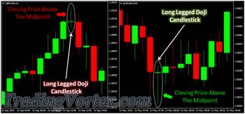
This pattern is marked by longer wicks or shadows than the standard Doji candlestick. This indicates that, during the timeframe of the candle price action dramatically moved up and down but closed at virtually the same level that it opened. This means that at some point during the pattern formation, both buyers and sellers tried to dominate, but there was no real winner when the candle closed. Traders here focus on the closing price, in relation to the mid-point (50% of the candlestick length).
- If the closing price is below the midpoint, it may look like a bearish pin bar and could be interpreted as a sell signal. The signal becomes stronger if it appears at resistance levels.
- If the closing price is above the mid-point, it may look like a bullish pin bar and could be interpreted as a bull signal. The signal becomes stronger if it appears at the support levels.
The Gravestone Doji Candlestick Pattern:
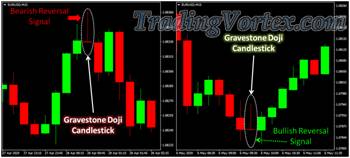
It forms when the opening price and the closing price occur at the point where the low of the period occurs. In other words the closing and opening prices are the same as the lowest price of the period. This pattern signals that the market has reached its top and will decline. It shows that the buyers were able to push the prices up but failed to sustain this bullish momentum when the candle closed.
- If it occurs during an uptrend, particularly at the resistance or Fibonacci retracement level, it may signal a bearish reversal trend.
- Conversely, if it occurs on a downtrend at the support or Fibonacci retracement level, it may indicate a bullish reversal.
The Dragonfly Doji Candlestick Pattern:
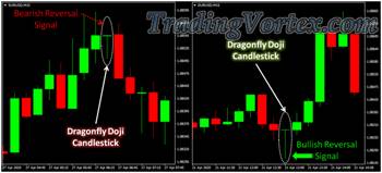
This pattern can be considered the opposite of the Gravestone. It has a longer lower shadow and signifies that the open, close and highest price were at the same level. Consider it like a ‘T’ shaped candlestick. They may appear at the top or bottom of uptrends or downtrends respectively and could indicate a change in market direction. If it forms at the bottom of a bearish move, it can be considered a bullish signal. Confirmation is strong when that happens on a support level.
The Four Price Doji Candlestick Pattern:
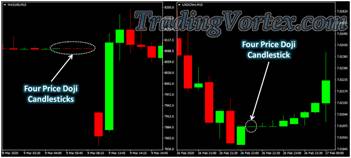
It means that all the four prices: high, low, open and close, were at the same level. This is characterized by a simple horizontal line, with no vertical line above or below it. It signifies a high degree of indecision or an extremely quiet market where prices didn’t move at all. If in the highly liquid Forex market such patterns are extremely rare, this often occurs in the stock market.
Bullish Candlestick Patterns:
- Bullish candlestick patterns are used by traders to identify the future price movement of a bullish trend.
- They are indications of a trend change from bearish to bullish or confirmation of a continuing bullish trend.
- A bullish candle is usually green or unfilled with a green or white outline and shows a closing price that is higher than the opening price.
- Bullish patterns can be in any time frame from 15 minutes chart to a daily one.
The Hammer Candlestick Pattern:
It is a type of bullish reversal candlestick pattern that shows a strong rising momentum in the market and heralds an end to the present bear trend. It have a very long lower wick or shadow (must be at least two times greater than the size of the body portion of the candle) and its body are small and at the top of a trading session with little or no upper wick. If this pattern occurs at the bottom of a downtrend it signals a potential reversal of the market trend. The color of the body doesn’t matter, however if the body is green (bullish color) it is considered more bullish.
Hammer Candlestick Pattern Examples:
Click on the image to open the full size version!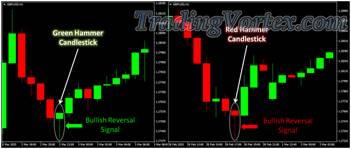
- From the examples above we can see that this pattern happened at the end of a bearish price trend.
- The candlesticks fall considerably lower after the opening only to spring back far above its central point.
- These candlesticks have no top wick and their shadow is more than twice the size of their body.
The Bullish Engulfing Pattern:
It is a reversal bullish pattern, which usually occurs at the foot of a downtrend and is a strong indication that the bulls have taken control of the market and the bearish price trend is coming to an end. This is a powerful bullish pattern because it changes the trading sentiment from a bearish one to a strong bullish one.
- The pattern consists of two Candlesticks: one is a bearish candle and the other is a bullish candle.
- The body of the first bearish candle is restricted within the body of the second bullish candle.
- The Forex market gaps down on the second Candle but the bears don’t get the upper hand for long as the bulls succeed in pushing prices much higher by moving prices higher than the previous opening.
Bullish Engulfing Pattern Examples:
Click on the image to open the full size version!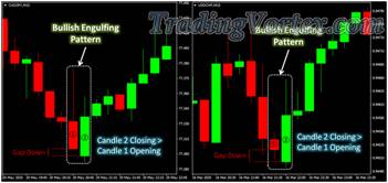
From the examples above we can see that this pattern is characterized by two candlesticks: the first candle (1) has a small red body whereas the second candle (2) has a bullish green body that completely overwhelms the main body of the first candlestick.
An engulfing pattern that is bearish is the exact opposite of the above.
The Harami Candlestick Pattern:
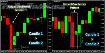
- It is known as a reversal bullish pattern and occurs with a first big bearish candle which is followed by a bullish much smaller second candle.
- The significant aspect of this bullish pattern is that the candle (2) has gapped up because the bears had been unable to get the price down and the bulls managed to push the prices up.
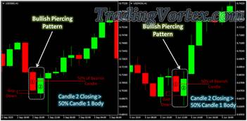
The Piercing Bullish Pattern:
- Is known as a reversal pattern which is fairly similar to the engulfing pattern. It is characterized by a first evident bearish candle followed by a second evident bullish one.
- The candlestick (2) opening price is lower than the candlestick (1) closing price.
- During the second time span the bulls take over and the price retraces most of the first bearish candlestick.
- This rejection of the first bearish pressure represents a strong bullish sentiment which absorbs over supply and increases demand.
Bearish Candlestick Patterns:
- Bearish candlestick patterns tend to signal a change in market sentiment from bullish to bearish.
- They indicate a possible change of trend from bullish to bearish or a continuation of a bearish trend.
- A bearish candle is usually red or filled in white with a green or black outline and shows a closing price which is lower than the opening price.
- Bearish patterns can be in any time frame from 15 minutes to a daily chart.
The Hanging Man Candlestick Pattern:
- This formation is one of the major bearish patterns.
- It nearly always happens at the summit of a bullish trend and warns of a possible downward reversal.
- The thinking behind the hanging man being bearish is that prices dropped considerably throughout the day showing that the bears were testing the bulls.
- The key to the future price movement is the next candlestick which will show traders whether the price will fall or go higher.
Hanging Man Candlestick Pattern Examples:
- The hanging man formation can be either a bearish candle (the open and the high are the same) or a bullish formation (the close and high are the same).
- The bearish formation is thought to be a stronger bearish sign than the bullish pattern.
Click on the image to open the full size version!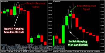
- As you can see from the above chart this formation is exactly the same as the hammer (a bullish formation) and is created when the close, the high, and the open are approximately at the same price level.
- The lower shadow is at least double the length of the main body of the candlestick.
The Shooting Star Candlestick Pattern:
- It is a bearish top reversal pattern that may appear in an up trending market.
- It has a long upper shadow or wick which is double the length at least of the main body.
- The body is close to the lower end of the trading range.
- It is formed when the close, the low and the open are approximately at the same price.
- It looks exactly the same as the Inverted hammer and indicates that the bulls have lost momentum and the bears are beginning to take control again.
- If the next candle closes lower, this confirms the end of the up trend.
Shooting Star Candlestick Pattern Examples:
- It could be bearish: when the close and the low are approximately the same.
- It could be bullish: when the open and the low are approximately the same.
- The bearish candlestick is thought to be a stronger because the bears rejected the bulls and pushed the price beneath the opening price.
- When the candlestick is formed with the opening price and low at the same price level the bears were able to reject the bulls but not quite capable of bringing the price back to the opening price.
- The upper shadow of the Shooting Star formation means that the locations of support and resistance were tested by the market and once located formed the high of the day.
Click on the image to open the full size version!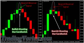
- As seen in the examples above, this pattern is recognized by a candlestick that forms at the end of a recent bull trend.
- After the candlestick opening, the shooting star continues to rise further only to fall appreciably forming a large wick.
- The wick is more than twice as long as the main body of the candlestick.




 TradingVortex.com® 2019 © All Rights Reserved.